
PowerSchool SIS Re-Architecture
A 20-year-old student information system. 70 million students. 6,000+ pages of legacy code. Three fundamental problems (navigation, security, and visual design) solved without rewriting a single line of the underlying application.
My Role
- Principal UX Designer, culmination of 14-year tenure (2007-2021)
- Complete information architecture analysis and redesign across 6,000+ pages
- Front-end architecture strategy bridging legacy codebase to modern design system
- Security model transformation from page-level obscurity to centralized CMS-style permissions
- Figma prototyping and facilitation of cognitive walkthroughs with long-term customers
- System analysis, user flow documentation, and content mapping
- Stakeholder presentations to executive leadership
Results
Executive Buy-In
Proposal accepted by company leadership. The first major SIS redesign in the platform’s history.
Validated with Real Users
Cognitive walkthroughs with customers averaging 10+ years of system experience. The vast majority were eager for the changes.
Design System Parity Without a Rewrite
CSS architecture achieved full visual consistency with the company’s Angular-based design system without touching millions of lines of application code
Security Fundamentally Transformed
A single-page security interface replaced a page-by-page permission model that had left sensitive student data exposed to anyone who knew a URL
Design Realized & Shipped
PowerSchool officially launched my redesign two years post-departure, and also integrating two of my award-winning hackathon innovations into the core platform.
By the Numbers
| 70M | Students served across the platform |
| 3,000+ | School districts using the system |
| 6,000+ | Pages of HTML audited, mapped, and reorganized |
| 20+ | Years of product evolution untangled |
| 14 | Years of tenure informing every decision |
| 10+ | Years of system experience among walkthrough participants |
| 40% | Reduction in design-to-development handoff time |
The Challenge
PowerSchool SIS is the dominant student information system in North American K-12 education, used by approximately 90% of the top 100 school districts in the United States, serving over 70 million students across 3,000+ districts. It’s mission-critical infrastructure. Schools run on it daily.
And it had been growing organically for two decades.
What began as a focused student information system had expanded feature by feature, acquisition by acquisition, into a sprawling platform of 6,000+ pages. The system worked. But the accumulated layers of complexity had made it increasingly difficult to navigate, nearly impossible to secure properly, and very hard to modernize.
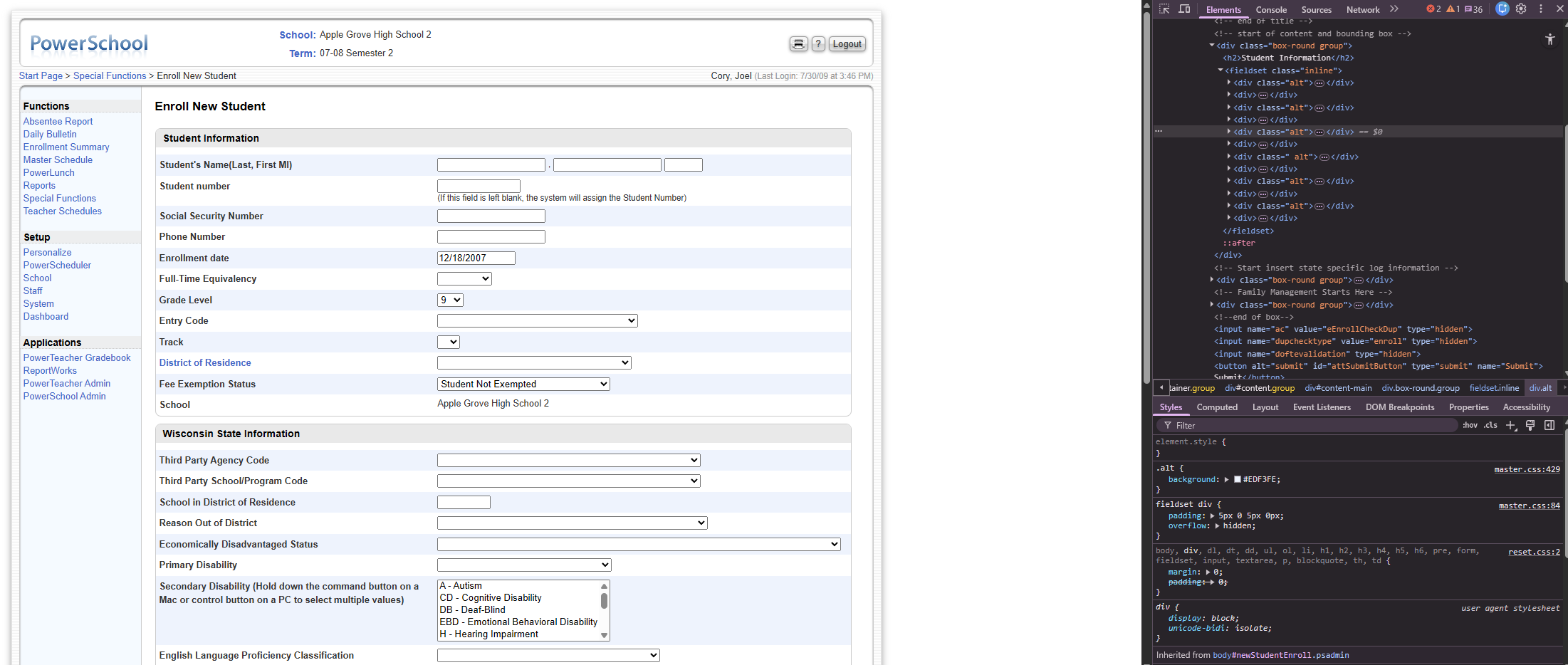
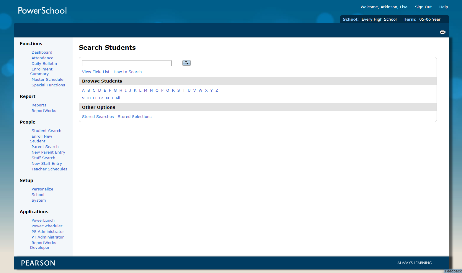
Navigation Organized by Accident
Workflows were linear and nested, requiring clicks through multiple pages of long link lists in tables. Content was organized by technology stack rather than by user tasks. Reports were split across four different pages, one per technology, forcing users to remember not just what they needed but which technology had generated it. A decade of acquisitions meant pages were grouped by where they came from, not what they did.
Security Built on Obscurity
Administrators were expected to set permissions page by page, individually, manually, for every one of the 6,000+ pages. The practical result was inevitable: most admins stopped managing permissions properly and instead “secured” the system by removing navigation links to sensitive pages. The pages remained fully accessible to anyone who knew the URL. Sensitive student data (grades, health records, disciplinary information) was exposed to anyone with a direct link.
This wasn’t a workaround. It was the de facto security model for a system serving tens of millions of students.
Visual Design Out of Sync
PowerSchool had invested in a modern Angular-based design system for its newer products. The SIS had been re-skinned and used a modern Less-based CSS structure, but it was out of alignment with the other products at PowerSchool that used the Angular design system. Recoding the SIS to use the Angular system required either a multi-year, multi-million dollar rewrite, or finding a better idea.
Angular Deal Breaker
PowerSchool also had legions of customizers and customers who relied on editable HTML to continue using the product. Angular created a wall that was not scalable for most of our customers. Because Angular code was so complex, they would not be able to customize the system to continue to meet their needs.
We would lose customers if we implemented Angular for the SIS.
Change is Hard
Change is inherently difficult. For power users, a system redesign can feel like an obstacle to their daily responsibilities. Yet, leaving a legacy system in its “archaic” state is just as problematic, as it forces new users to navigate a steep, unintuitive learning curve. My goal was to solve for both: protecting the productivity of long-term veterans while creating a streamlined experience that doesn’t require “tribal knowledge” to operate.
The Goal
Modernize the PowerSchool SIS experience without a full codebase rewrite. Reorganize navigation around user tasks instead of technology stacks. Replace the security-through-obscurity model with genuine, manageable access controls. And bring the visual design in line with the company’s newer design system, all while maintaining every customization that 3,000+ districts had built over years of use.
The Constraints
This wasn’t a greenfield project. Millions of lines of code across 6,000+ pages ruled out a full rewrite. The labor cost was too high, the risk too great, it would disrupt too many concurrent projects, and we would lose customers. The platform’s defining characteristic was its customizability: districts could rewrite entire pages at the HTML level. Those customizations had to be preserved. HTML frames, a legacy technique already removed from the HTML5 specification, needed to be eliminated from the few remaining pages that used them. And the security model needed fundamental improvement without breaking backward compatibility.
The constraints, in other words, required solutions that were clever rather than brute-force.
Our Users
| User Type | Primary Tasks |
|---|---|
| Systems Administrators | Manage users, access, server settings, system configuration |
| Attendance Clerks | Daily attendance, attendance data and reports |
| School Administrators | Review student information, run reports |
| School Staff | Health data, fees, classroom data, grades |
| State Reporting | Generate compliance reports for state funding |
14 Years in the Making
This redesign project was only possible because of decisions I’d made years earlier, in some cases more than a decade before. Understanding why requires a brief look at the foundational work that preceded it.
2010: The Front-End Migration
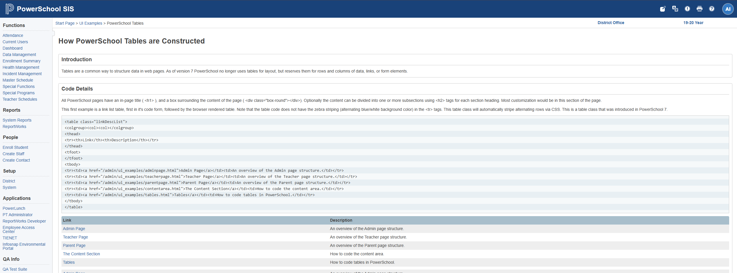
When PowerSchool migrated from its legacy 4D platform to Java in 2010, the front end was still built entirely with HTML framesets, nested tables, sliced images, and inline JavaScript. I proposed and led a complete front-end rewrite alongside the Java migration, turning 6,000 pages of legacy markup into standards-based, semantic HTML and CSS.
I wrote complex regular expressions that could read every page on the server and rewrite it to a standard template. At the end of the project, I could migrate the entire front end in minutes. The result: a codebase with clean, consistent, accessible, testable HTML, and a CSS layer that was fully decoupled from the application logic underneath.
This is what made the design system strategy possible a decade later. Because the HTML was semantic and standards-based, the visual layer could be completely swapped by updating CSS alone. No application code needed to change.
2010: The Component Library
Alongside the migration, I built a JavaScript component library (dialogs, modals, tabs, accordions, toggles) using standardized HTML patterns and class-name conventions that let JavaScript layer interactivity onto markup without touching the HTML itself. Documentation shipped inside the codebase so engineers and third-party customizers had the specs right in their environment.
This was a design system in 2010, before Bootstrap launched in 2011 and years before the industry had a name for the practice.
The Page Registration System
To manage customizations at scale, we built a system that registered every page in the platform to a database. When updates shipped, the system flagged which pages had been customized by districts, so the engineering team knew exactly what needed testing and what could be updated automatically. Districts could also compare the changes, and choose the new version, and re-implement their customizations.
This database of pages, originally built for customization tracking, became the foundation for my security solution innovation years later (I won second place in a company hackathon for this innovation). The infrastructure was already there. I just wanted to extend it for a new application.
The Solutions
Challenge #1: Design System Without Rewrite
PowerSchool had adopted an Angular-based design system built on ZURB Foundation for its newer products. It was intended to allow all new applications to look and feel consistent. The SIS did not use this system. A full rewrite to bring it in line would have required years and millions of dollars of engineering time across 6,000+ pages.

Design systems require regular maintenance. Since updates aren’t automatically inherited, deferred implementation leads to “version drift,” causing products to fall out of sync with the system and each other. Most of PowerSchool’s systems were adrift.
The solution was already in the codebase. Because the 2010 migration had produced clean, semantic, standards-based HTML, the visual layer was completely decoupled from the application. I developed a CSS architecture that matched the design system’s visual language (colors, typography, spacing, component patterns) while the existing HTML structure remained untouched.
The result: a front end that looked indistinguishable from the modern design system, achieved by updating stylesheets rather than rewriting applications. This approach also reduced design-to-development handoff time by 40%, because engineers were working from a consistent, documented visual language rather than interpreting designs from scratch.
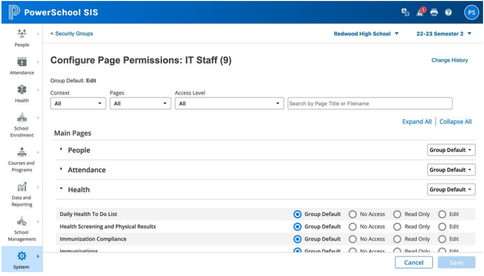
Challenge #2: Security Model Transformation
The core problem wasn’t just that the security UI was bad. It was that it was so difficult to use correctly that administrators had invented their own workaround, and that workaround left student data exposed.
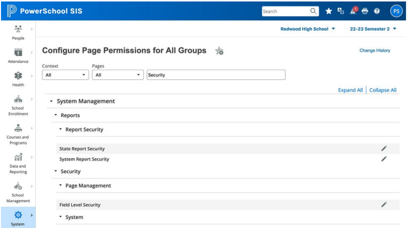
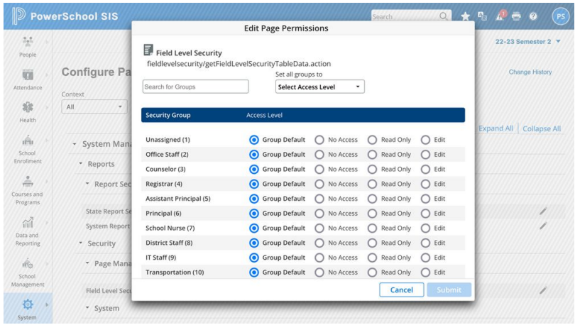
The insight came from the page registration system we’d built years earlier. Every page in the platform was already stored in a database, originally to track customizations. That database was a complete catalog of every page in the system. What if page permissions were simply a property of each page record?
With my innovation of cataloging the system in the database multiple benefits were possible:
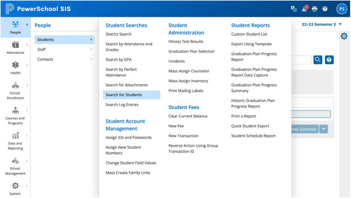
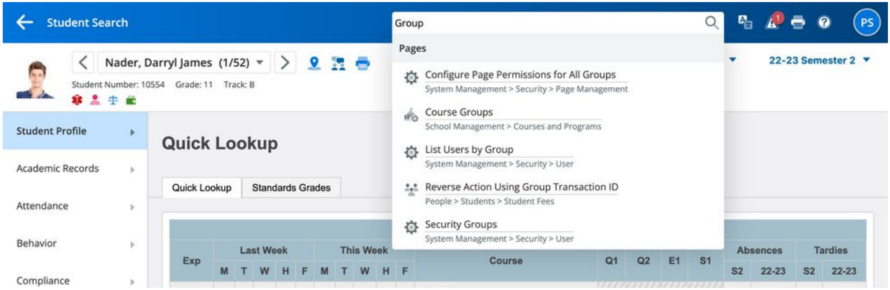
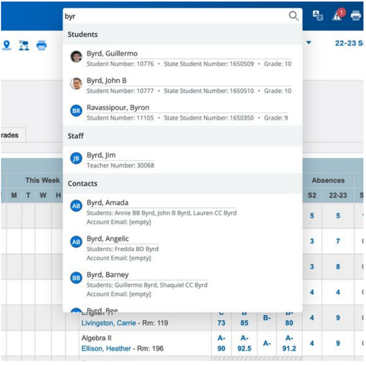
- Site wide search for pages, content, and people
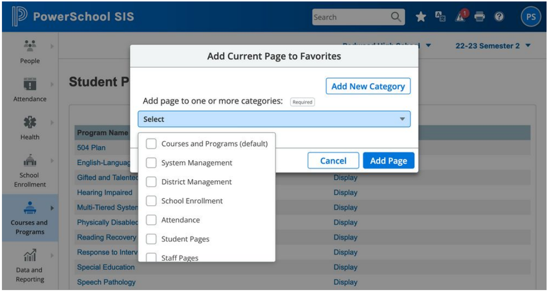
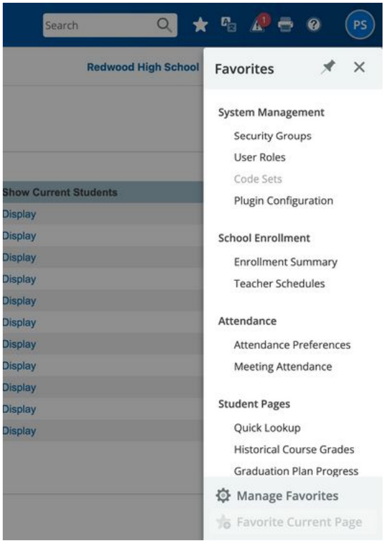
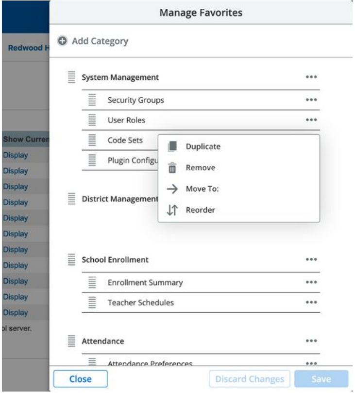
- Users could “favorite” pages
“Moving the users cheese” was mitigated by their ability search and find pages that had moved. Existing long time users no longered feared change, and new users benefitted from the new clean IA.
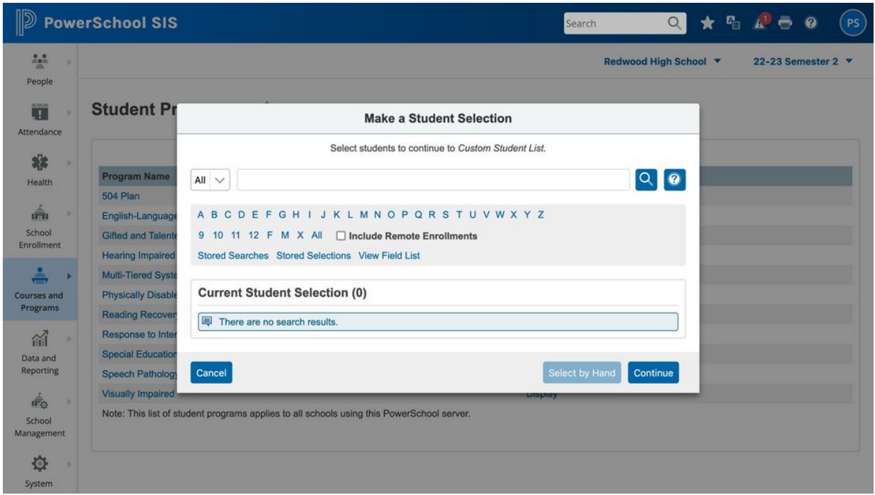
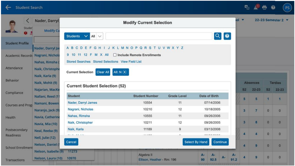
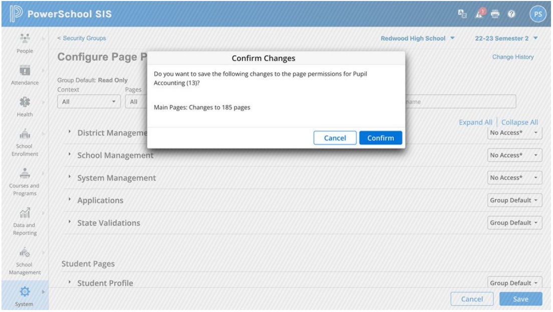
That reframing changed everything. Instead of a permission model where administrators visited each page to set access, security became a single administrative interface: a searchable, filterable list of every page in the system, with permissions managed from one place. What had previously required visiting 6,000 pages individually could now be managed in minutes.
Real security replaced security through obscurity. Administrators could actually manage access. And sensitive student data was no longer a known URL away from anyone curious enough to type it in.
Challenge #3: Information Architecture Overhaul
Navigation had been organized by technology stack, which meant it reflected the internal architecture of the software rather than what users were trying to accomplish. Reports generated by different technologies lived on different pages. Features from acquired products lived wherever they’d been dropped in at the time of acquisition.
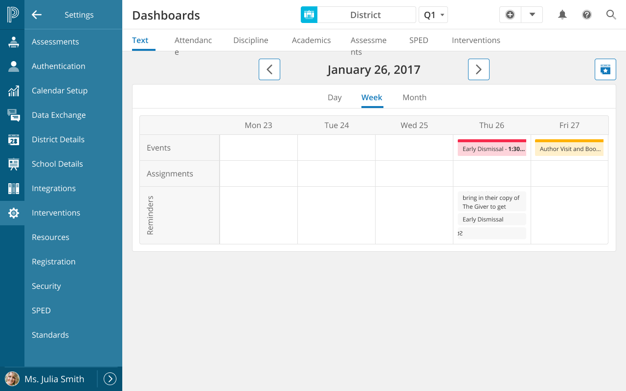
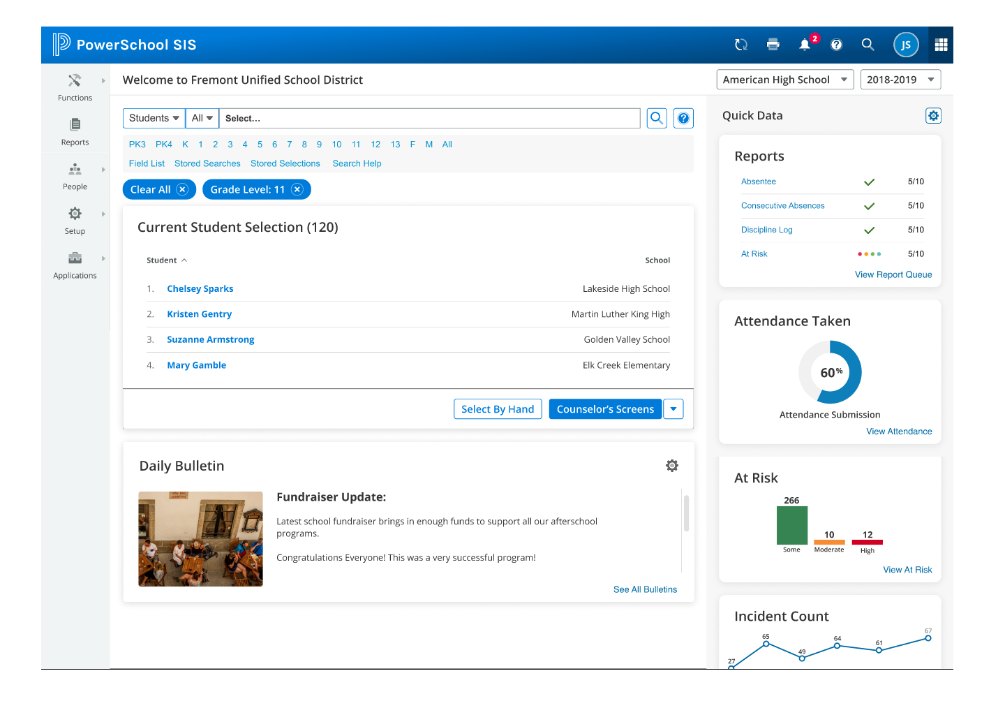
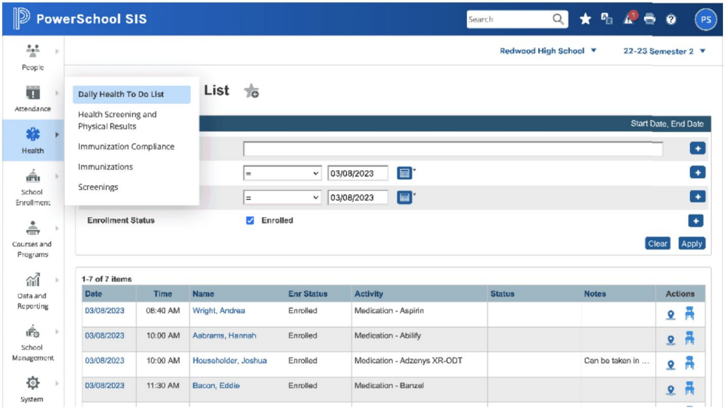
I conducted a complete content audit, mapping all 6,000+ pages and their relationships, and reorganized everything by user tasks and workflows. All reports in one place, regardless of which technology generated them. All student data functions grouped by student, not by feature origin. Navigation depth was simplified, long link-list tables replaced with structured, hierarchical navigation, and the information hierarchy designed to match actual mental models rather than system architecture.


Validation
Executive Presentation
I pitched the concept to product group leadership: three distinct solutions, each addressing a fundamental platform problem, each achievable without a codebase rewrite. The response was enthusiastic and the proposal was accepted.
Cognitive Walkthroughs
Created high-fidelity, clickable Figma prototypes and ran structured cognitive walkthroughs with long-term customers. These weren’t casual or new users. Many had 10+ years of daily experience with the system. They knew every corner of it: the quirks, the workarounds, the navigation paths they’d memorized through repetition.
The vast majority were not just accepting of the proposed changes. They were eager for them. That response, from users who had deep investment in the existing system, was the strongest possible validation that the redesign was addressing real pain, not just aesthetic preference.
Interactive Prototypes
Main Navigation Flow: Redesigned main navigation, task-based report organization, import/export process flows
Page Permissions Flow: Single-page security administration interface and permission management workflow
Success Metrics
What We Proved
- Executive Acceptance: Proposal approved by company leadership for implementation
- User Validation: Cognitive walkthroughs with experienced, long-tenured customers confirmed the approach
- Design System Parity: Visual consistency with the Angular-based design system achieved without any codebase rewrite
- Security Model: Centralized permission management validated as a direct replacement for the page-by-page approach
- Handoff Efficiency: 40% reduction in design-to-development handoff time through standardized visual patterns
The proposal was accepted by the company in my final year. Implementation status post-departure is unknown, though the architecture, prototypes, and documentation were handed off to the engineering team as a complete, actionable plan.
They Built My Design
In the process of updating my portfolio, I discovered that my design finally shipped! It’s amazing to see your work alive and well even years after you designed it. I had no hopes that they would prioritize this project, especially after I left.
Yet, here it is:
Reflections
The Power of Invisible Infrastructure
The most important work I did at PowerSchool wasn’t the redesign proposal. It was the 2010 migration: 6,000 pages of standards-based HTML that nobody saw, the component library that made customizers self-sufficient, the page registration database that was built for one purpose and later repurposed for another. None of that felt strategic at the time. It was just the right way to build things.
A decade later, it was the entire foundation of the redesign. The CSS strategy only worked because the HTML was clean. The security innovation only worked because the page catalog already existed. The most impactful design decisions are often the ones that don’t feel like design at all.
Enterprise Systems Require Different Thinking
You can’t approach a 20-year-old system serving 70 million students the way you’d approach a greenfield project. There are 20 years of user behaviors, workarounds, and muscle memory to account for. The answer isn’t to ignore all of that and start over. It’s to find the seams where a carefully considered change can modernize the experience without breaking what works.
Security UX Is Security
When security is difficult to manage, administrators don’t manage it. They work around it. Making security easy to manage is itself a security improvement. The new interface didn’t just look better. It enabled administrators to do the job that the old interface made impossible.
Long-Tenured Users Are Invaluable Partners
Users with 10+ years of experience in a system are the hardest to convince and the most meaningful to validate with. When those users respond to a proposed redesign with enthusiasm rather than resistance, it’s evidence that the redesign is solving real problems, not just imposing new ones.
Context: 14 Years at PowerSchool
This project was the culmination of 14 years on the PowerSchool platform (2007-2021). Over that tenure I grew from sole designer to leading a team of 5, standardized 6,000+ pages of HTML through automated migration tooling, built a component library that predated the modern design system movement, and created the page registration infrastructure that powered both customization management and the security transformation.
Every solution in the redesign traced back to prior work: the CSS strategy to the 2010 migration, the security innovation to the page registration system, the IA overhaul to years of watching how users actually navigated versus how the system was organized. Fourteen years of incremental, foundational work created the leverage for a transformative change.
Related Projects
- Design System Work: The front-end migration and component library that made this redesign possible
- Educational Ecosystem