Design Systems Before They Had a Name
Building component libraries, front-end architectures, and systematic design practices across PowerSchool, SNHU, and FedPoint – from a home-grown component system in 2010 to federal accessibility standards and multi-brand design governance.
My Role
- Sole designer and front-end developer responsible for migrating 6,000+ pages from legacy markup to modern, standards-based HTML and CSS (PowerSchool, 2010)
- Creator of a JavaScript component library that predated Bootstrap and the modern design system movement
- CSS architect bridging a legacy SIS platform to an Angular-based design system without rewriting the codebase
- Design system contributor defining component specs and interaction patterns for a multi-application educational ecosystem (SNHU)
- Design system lead delivering USWDS-based, WCAG AA-compliant component libraries supporting multiple brands (FedPoint)
Overview
I’ve been building design systems for most of my career – I just didn’t always call them that. In 2010, I wrote a reusable component library with standardized markup patterns, self-documenting code, and a theming architecture that updated every component when the visual design changed. Bootstrap wouldn’t ship until 2011. Google’s Material Design wouldn’t arrive until 2014. The term “design system” wouldn’t enter common industry vocabulary for years.
That early work set a pattern I’ve repeated across every engagement since: build systematic, documented, adoptable front-end architectures that serve both designers and engineers – and that survive contact with real-world constraints like legacy codebases, multiple brands, and teams who didn’t build the system.
PowerSchool: The Front-End Migration (2010)
Context
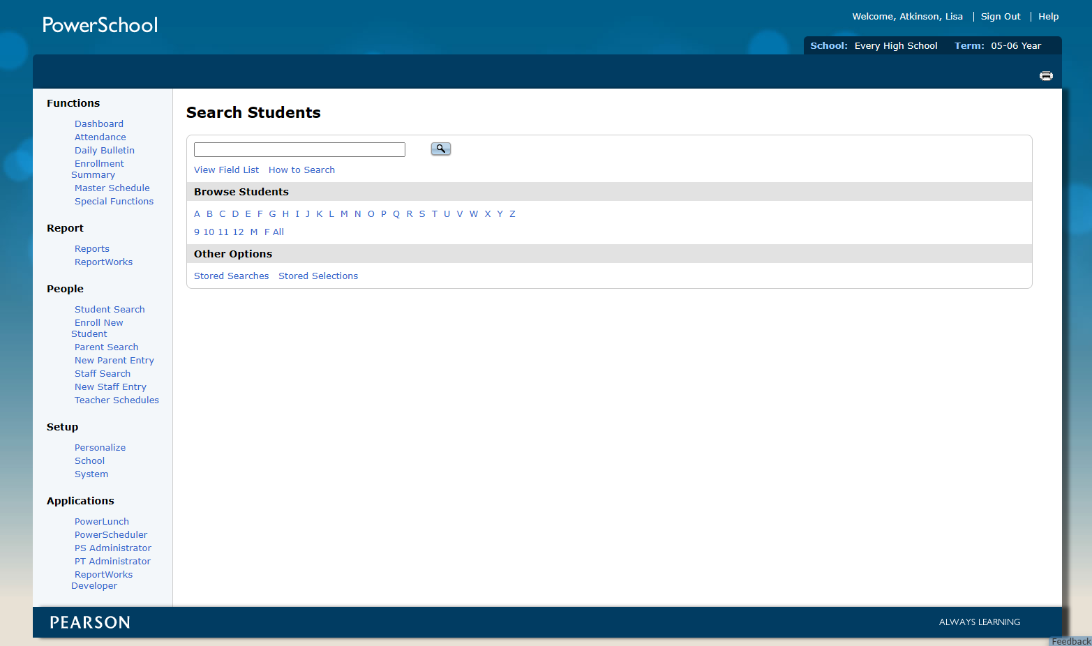
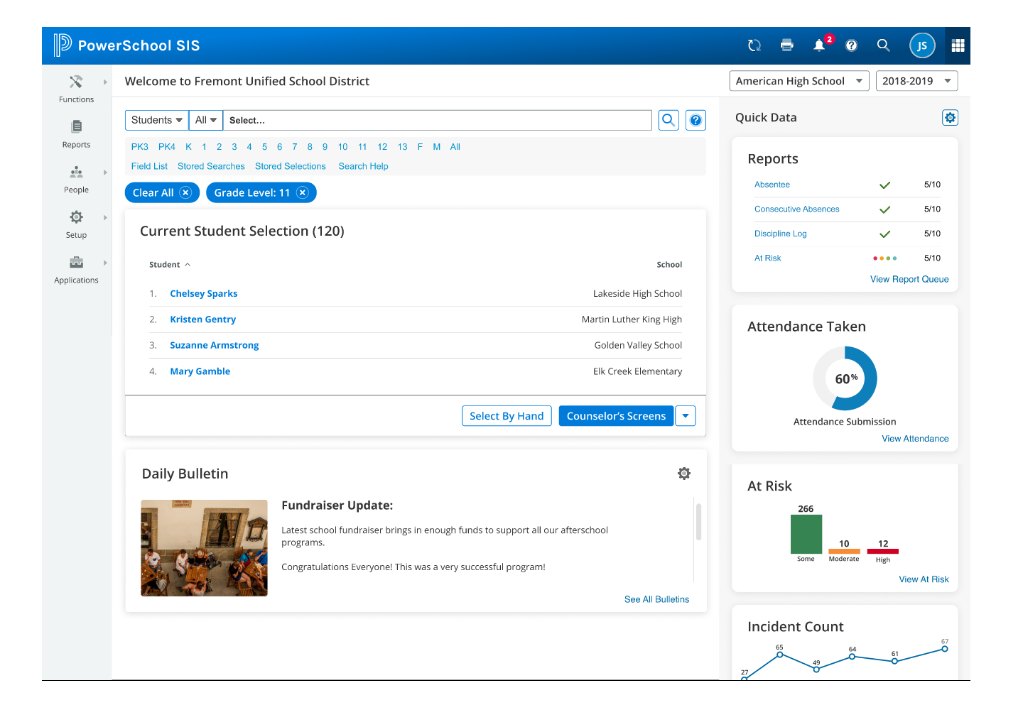
While I worked at PowerSchool as the solo UI/UX designer, I was also a key contributor to the front-end development for most of my 14-year tenure. PowerSchool SIS is the dominant student information system in North American K-12 education, serving over 60 million students across thousands of school districts.
The End of an Era
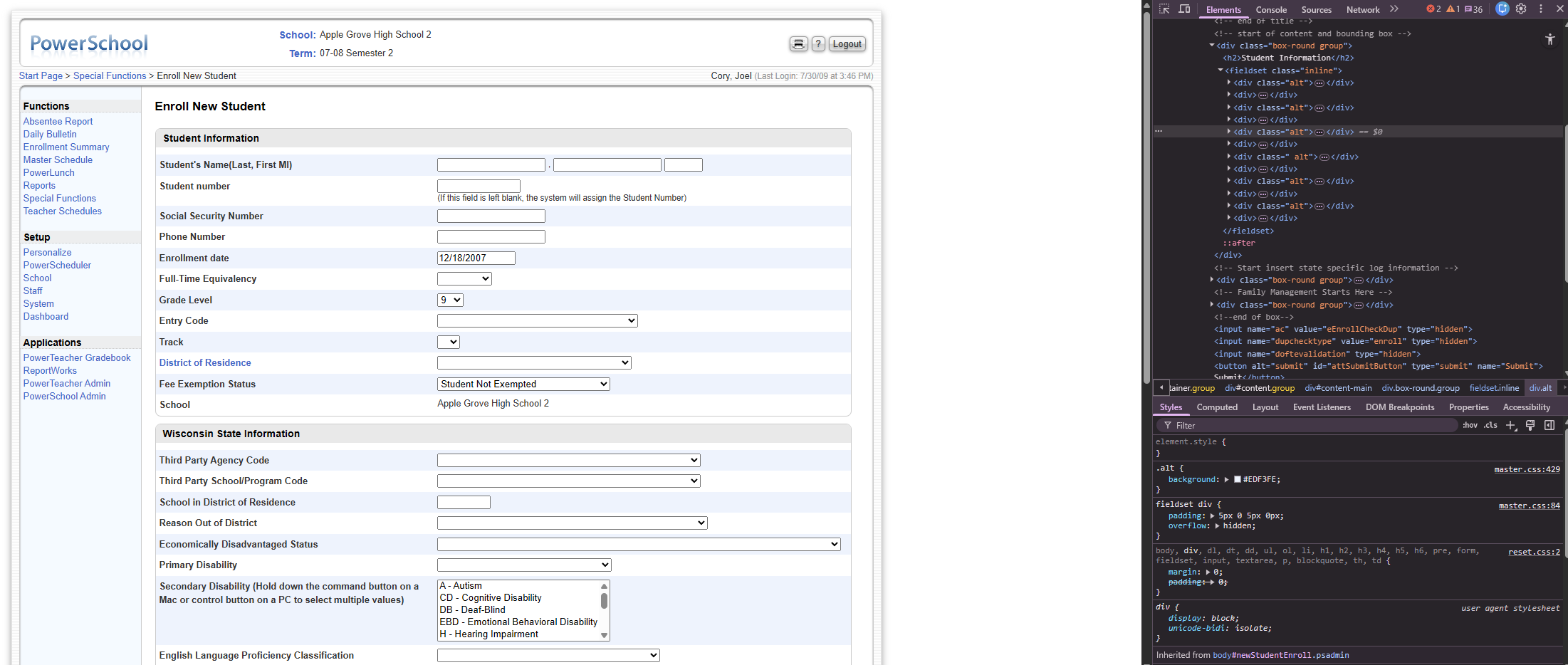
In 2010 our team completely migrated the codebase from 4D (4th Dimension) to Java. 4D was a proprietary development platform originally released in 1984 – a front end and non-relational database all rolled into a single compiled application. It had been popular for Mac-based business applications through the 1990s, but by 2010 it was deeply dated. Each file had an 8K limit, so the code had gotten very creative over the years.
The front end wasn’t any better. Every page consisted of nested tables inside of framesets, sliced images, and image-based buttons. For context: HTML framesets divided a browser window into multiple independently scrolling documents – a technique common in the late 1990s that was eventually removed from the HTML5 specification entirely because it broke bookmarking, the browser back button, screen readers, and any possibility of responsive design. There was no consideration for accessibility or responsiveness. To be fair, these were fairly new concepts and this was 20-year-old software.
The UI was also very dated looking, and while I’m usually more a function-over-form designer, this site needed a massive redesign. I took inventory of the pages we had and how they functioned, and set out to redesign the entire site from the ground up.
The Proposal
While the Java engineers were coding their portion, I presented a proposal to rewrite the entire front end using CSS and modern HTML layouts – providing a future-proof, flexible front end and facilitating the visual refresh I had designed.
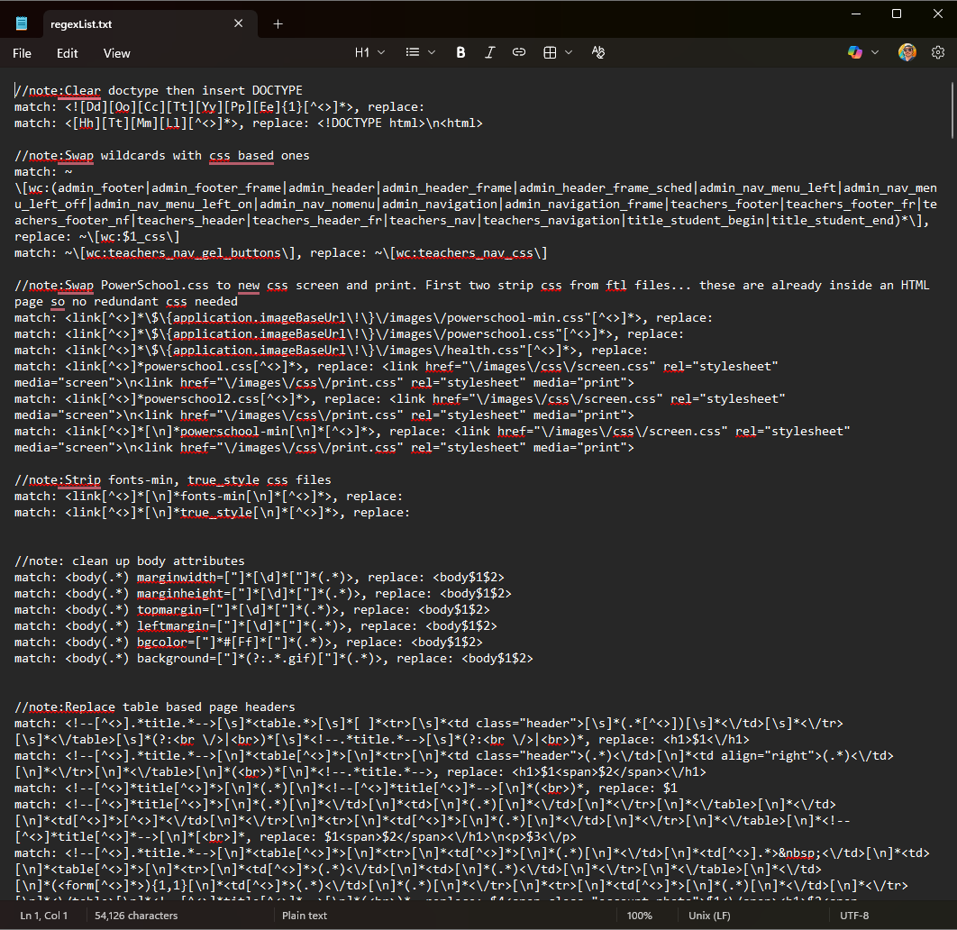
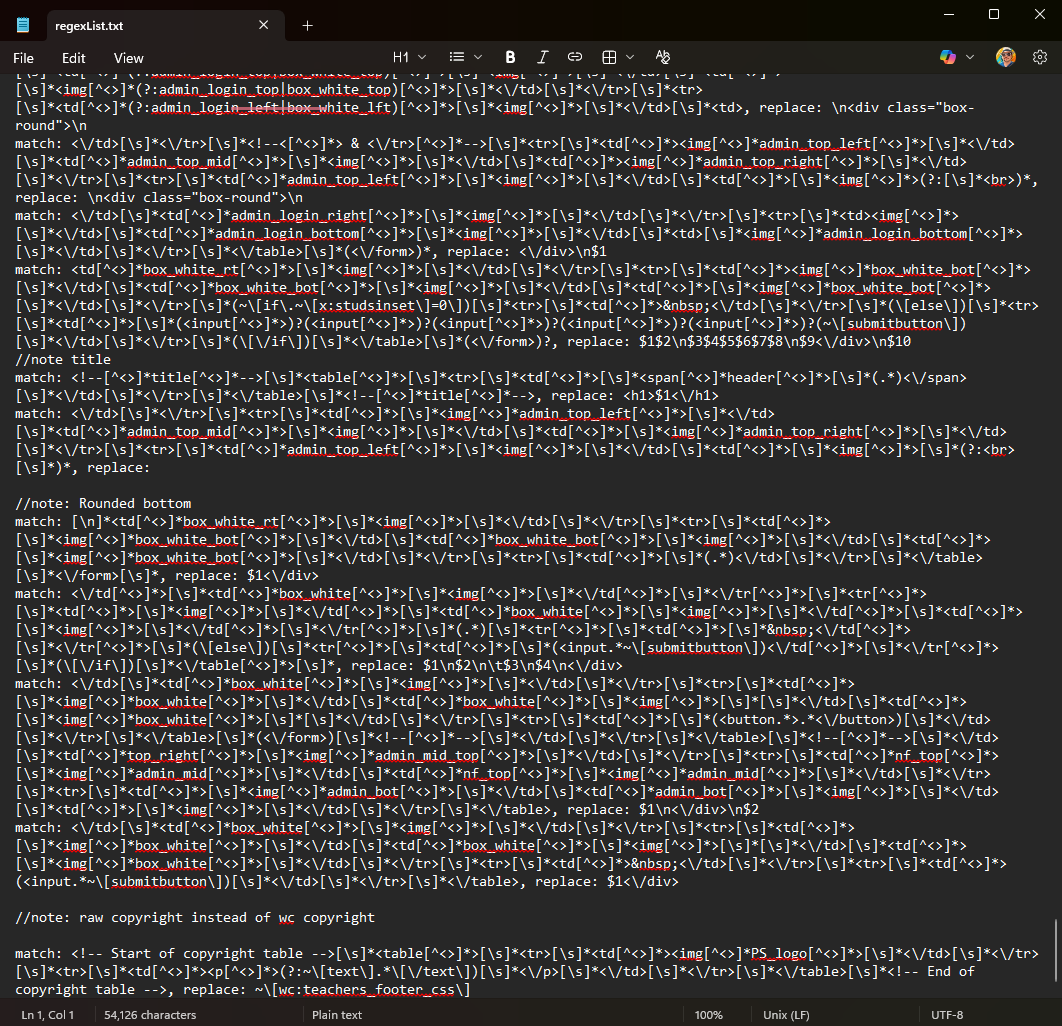
Automated Migration at Scale
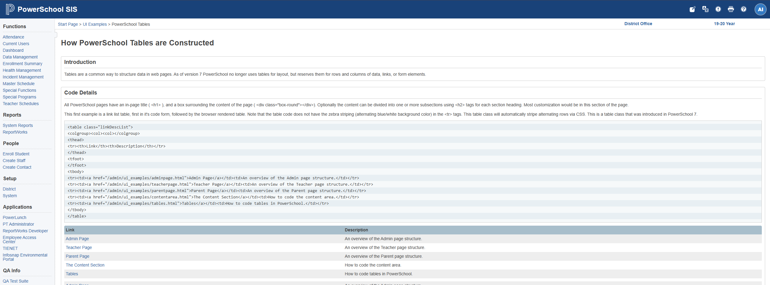
I wrote multiple complex regular expressions that would read every page on the server and rewrite them using standard page templates. By the end of the project I could migrate the entire front end (6,000 pages) in minutes. There were a handful of outliers (only 5% of the pages) which needed hand coding, but largely the site was fully migrated.
What We Shipped
The company shipped a new version that year with the following improvements:
- Responsive layout – pages adapted to screen size, replacing fixed-width table layouts
- Accessible markup – semantic HTML with proper structure for screen readers and assistive technology
- Localizable interface – structure that supported internationalization
- Automated testing support – CSS IDs and classes gave QA engineers reliable hooks into the DOM
- Framesets eliminated – replaced with standard page layouts and CSS-based positioning
- jQuery integration – a modern (for 2010) JavaScript foundation replacing inline scripts
- Unobtrusive JavaScript – behavior separated from markup, following the progressive enhancement principles championed by web standards advocates like Jeremy Keith. Pages still functioned without JavaScript enabled, and no inline event handlers cluttered the HTML
- Print CSS – dedicated print stylesheets replaced duplicate “printer-friendly” pages, cutting maintenance and eliminating an entire class of bugs where the print version fell out of sync
- CSS hover states – interactive states handled in CSS instead of JavaScript image swaps
- LESS CSS preprocessor – LESS had just been released in 2009, and I introduced it to bring variables, nesting, and mixins to our stylesheets. This was the same preprocessor Twitter Bootstrap would later adopt for its first releases
PowerSchool: A Component Library Before Its Time (2010)
The Challenge
PowerSchool was sold as a completely customizable Student Information System. Customers could rewrite entire pages at the HTML level, and they continued to work. There was an entire cottage industry of customizers writing new modules and functionality for the platform.
Our team needed reusable components, but the customizers weren’t typically programmers – they were school district IT staff and educational technology specialists. Existing component libraries on the market required heavy amounts of rewriting and assumed significant programming experience. We needed something that was baked into the platform and accessible to non-developers.
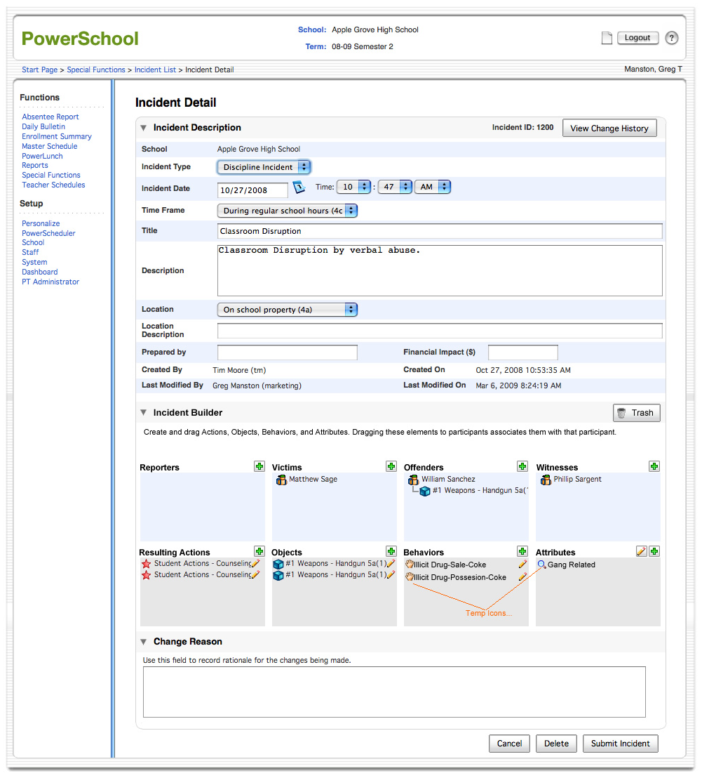
What I Built
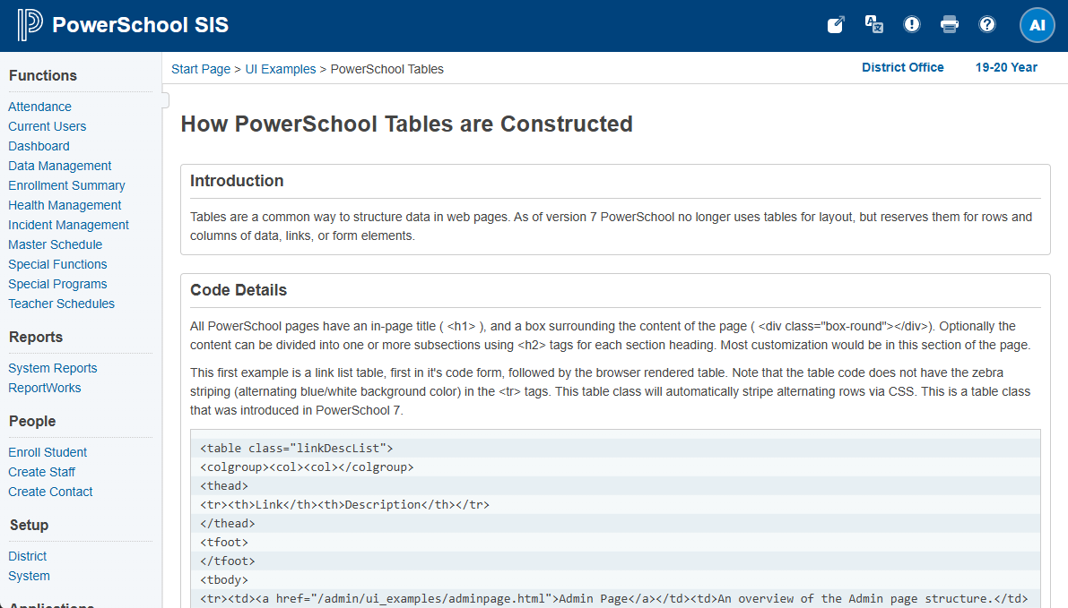
I designed and wrote multiple JavaScript-based components: dialogs, modals, tabs, accordions, and toggles. Each used a standardized HTML template pattern with specific class names that allowed the JavaScript to hook into the DOM and layer interactivity onto the markup. No configuration files, no build steps, no framework dependencies – just write the HTML pattern, and the component worked.
This followed the unobtrusive JavaScript philosophy: the markup was meaningful on its own, and the JavaScript enhanced it progressively. If scripting was disabled, the content was still accessible.
Documentation Shipped in the Code
I documented every component – what it did, when to use it, and the exact HTML pattern to replicate it – and shipped the documentation as part of the codebase itself. When an engineer built their local environment, they had blueprints and instructions right in their code. Customizers could pull up the documentation page and build new pages, or customize existing pages, with components that matched the rest of the system.
Why This Mattered
This was a home-grown design system in 2010. Twitter’s Bootstrap – widely considered the first mainstream front-end component framework – wouldn’t launch until August 2011. Google’s Material Design wouldn’t arrive until 2014. The industry wouldn’t widely adopt the term “design system” until years after that.
My system was purpose-built for its context: baked into the platform, accessible to non-programmers, self-documenting, and themeable. When we updated the UI, every component inherited the changes automatically. It wasn’t theoretical – it shipped to thousands of school districts and was used by an ecosystem of third-party customizers.
PowerSchool: Bridging to the Official Design System
The Problem
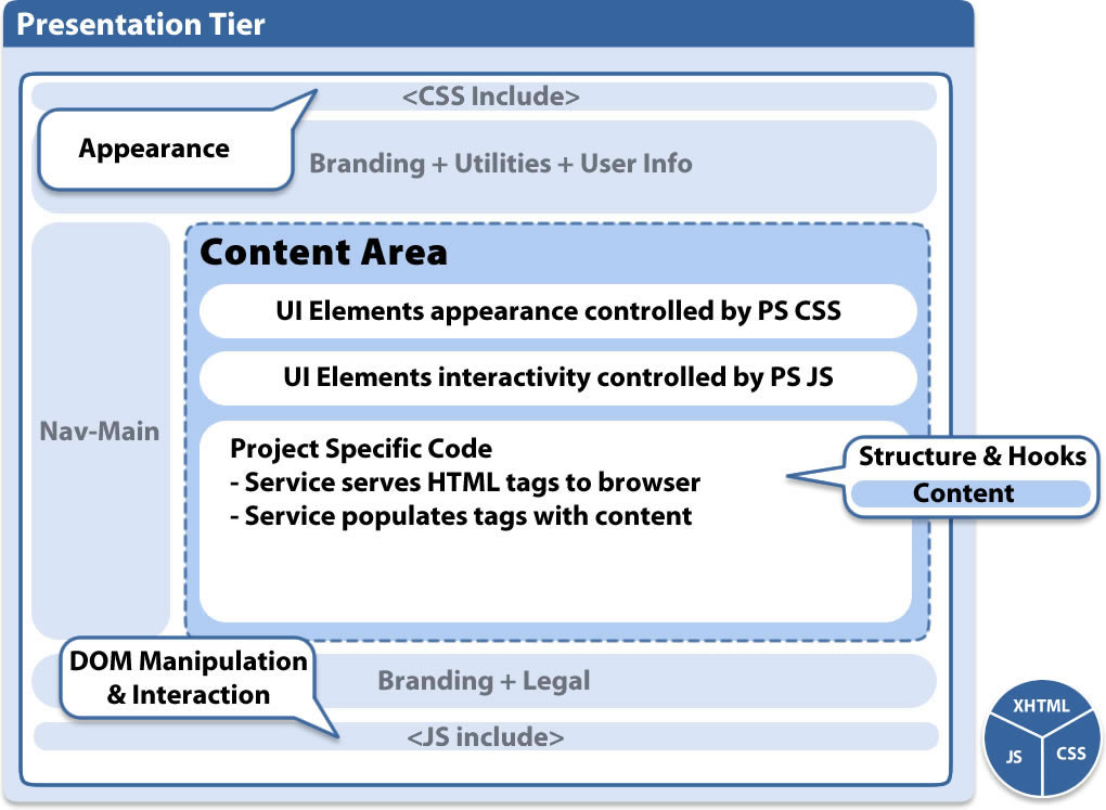
Later, PowerSchool adopted an Angular-based design system built on ZURB’s Foundation framework – a responsive front-end framework that provided grid systems, UI components, and styling patterns. But the legacy SIS (6,000+ pages) wasn’t built in Angular. A full rewrite would have cost millions, taken years, and introduced enormous risk to a product serving tens of millions of students.
My Solution
I developed a CSS architecture that matched the design system’s visual language while preserving the existing HTML structure. This worked because years of foundational work had already brought the markup to semantic, standards-based HTML. The CSS layer could be swapped without touching the underlying structure – visual consistency achieved without the multi-year rewrite.
This approach:
- Created sustainable front-end standards that aligned with the official system
- Enabled gradual modernization without a full rewrite
- Reduced design-to-development handoff time by 40% through shared visual patterns
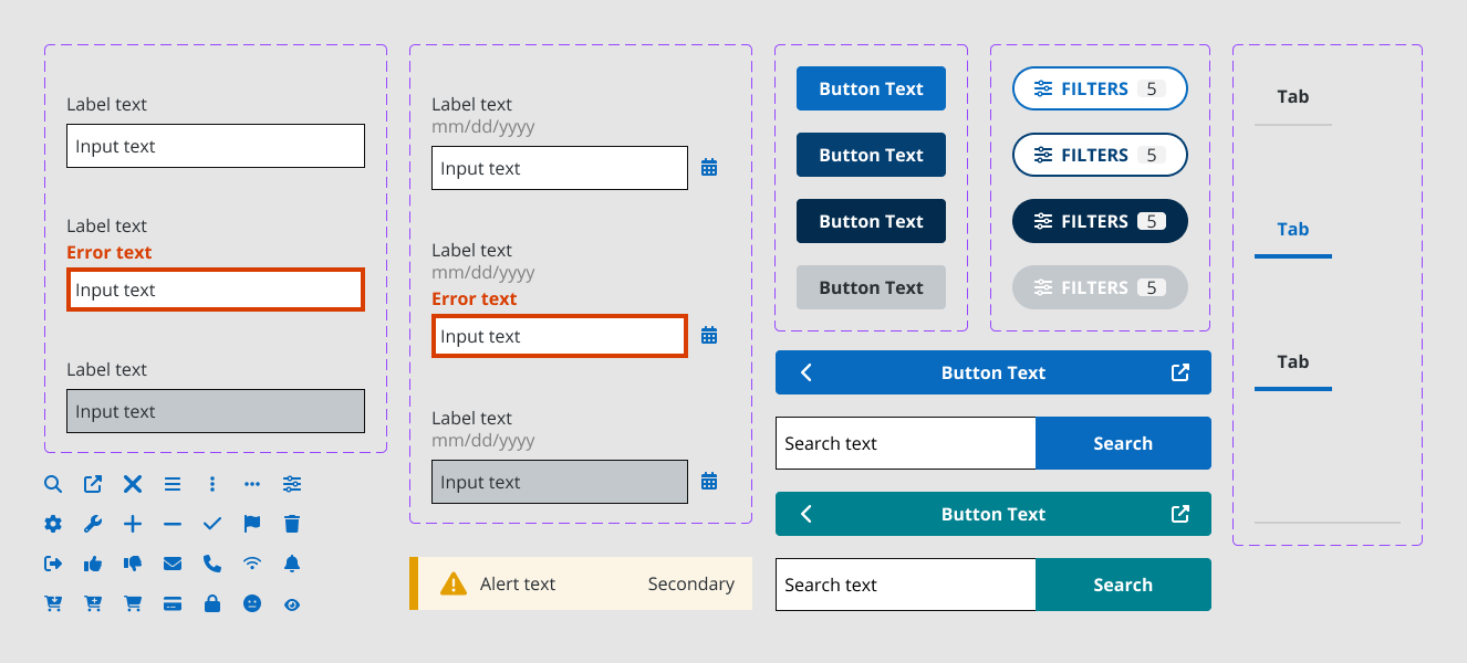
Pattern Library
I built a design pattern library documenting:
- Component specifications with visual examples
- Usage guidelines defining when and where to use each pattern
- Interaction patterns for consistent behavior across the platform
- Accessibility requirements ensuring WCAG compliance

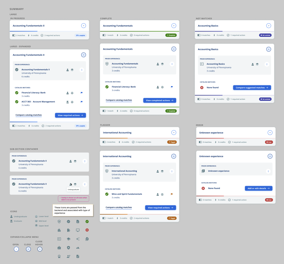
SNHU Ecosystem (Confetti Design System)
Context
Southern New Hampshire University’s next-generation educational ecosystem consisted of multiple applications – authoring tools, learner experiences, administrative interfaces – built by different development teams across the organization. Without a shared design language, each team was making independent UI decisions, leading to inconsistency across the student and administrator experience.
The ecosystem used an internal design system called Confetti, which needed contributions and expansion to cover the authoring and builder tools I was designing as UX Architect.
My Contribution
- Defined component specifications for the authoring tools, ensuring new builder interfaces used established patterns rather than introducing one-off solutions
- Documented builder-specific interaction patterns – drag-and-drop behaviors, inline editing, and content assembly flows – and contributed them back to the shared system
- Established consistent interaction models so that a user moving between the learner experience, the authoring tools, and administrative views encountered familiar patterns throughout
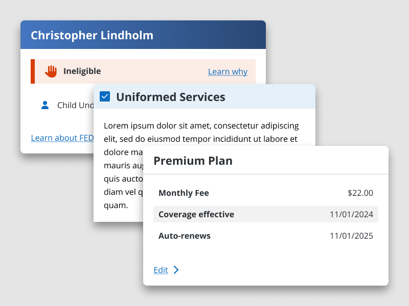
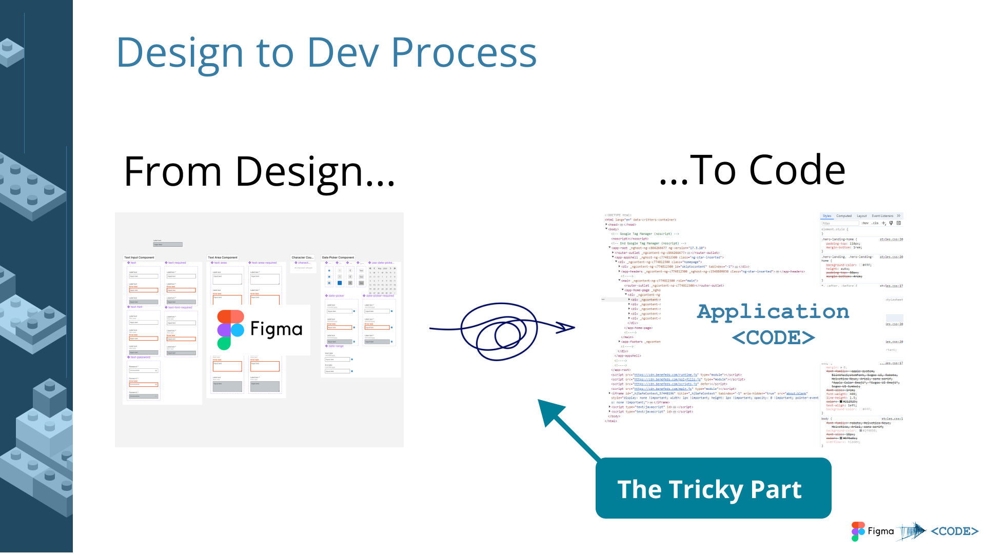
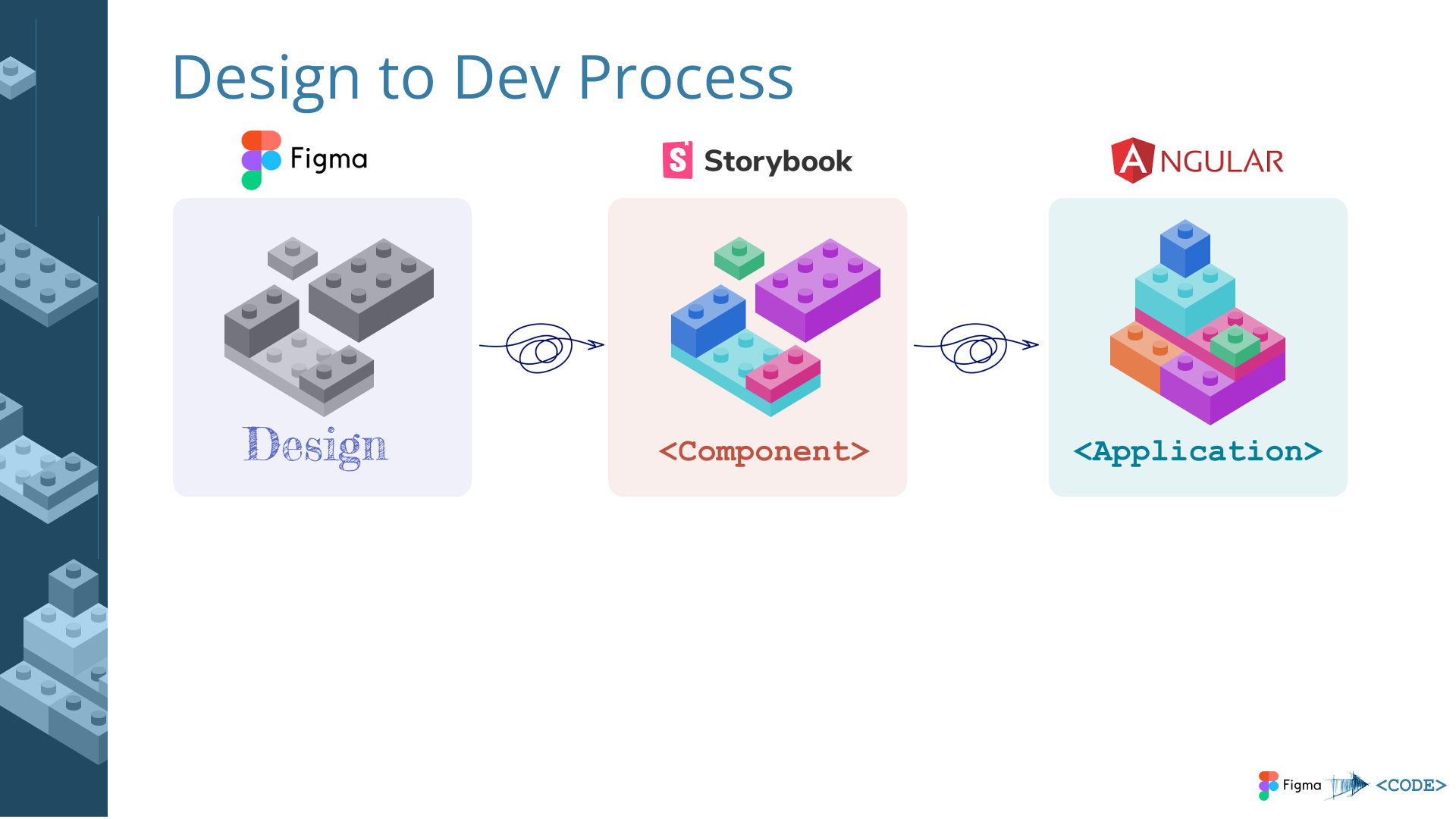
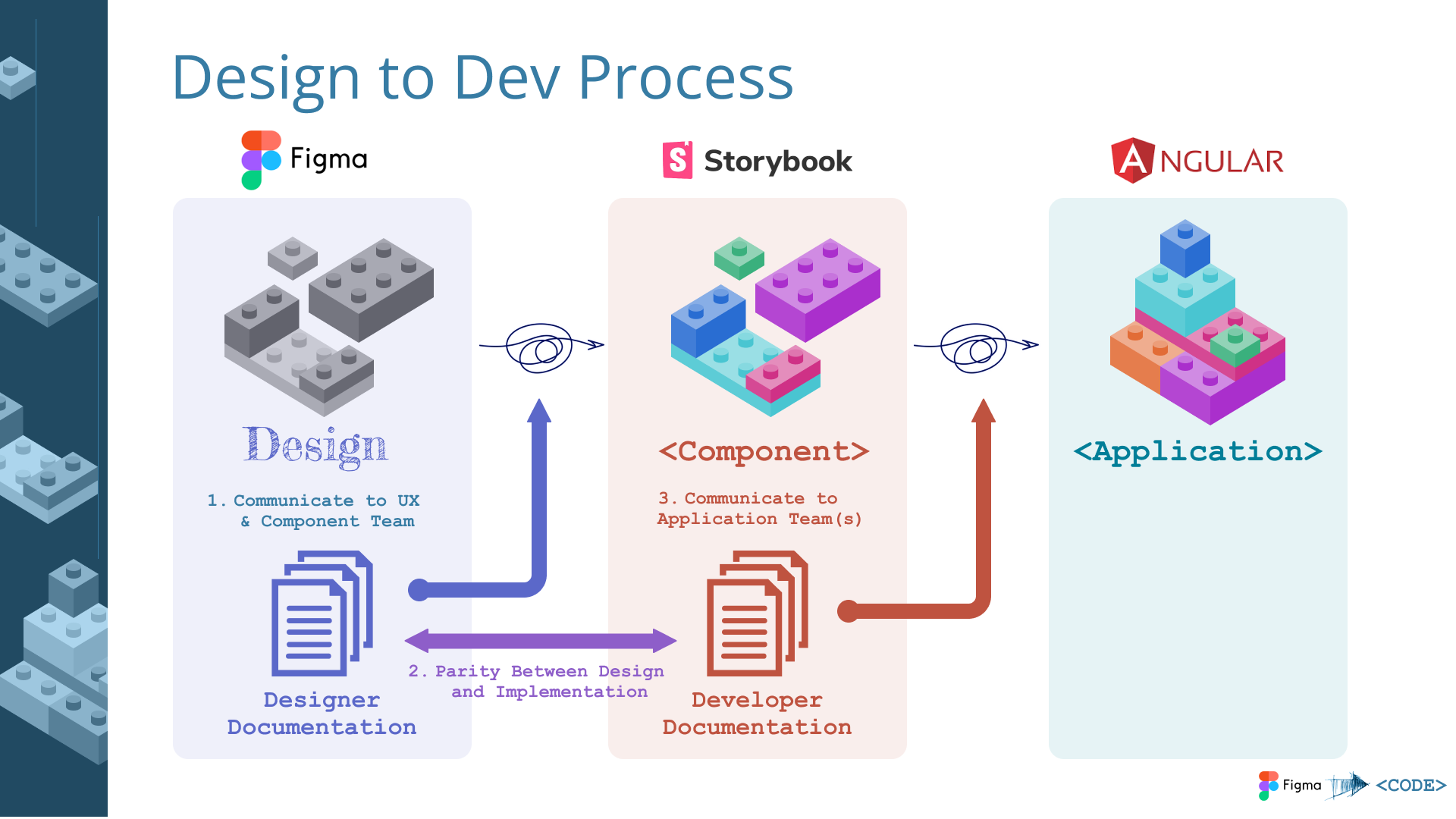
FedPoint (USWDS-Based Design System)
Context
FedPoint administers federal employee benefits programs. Their digital products needed to meet federal accessibility standards and support two distinct product brands from a single component architecture.
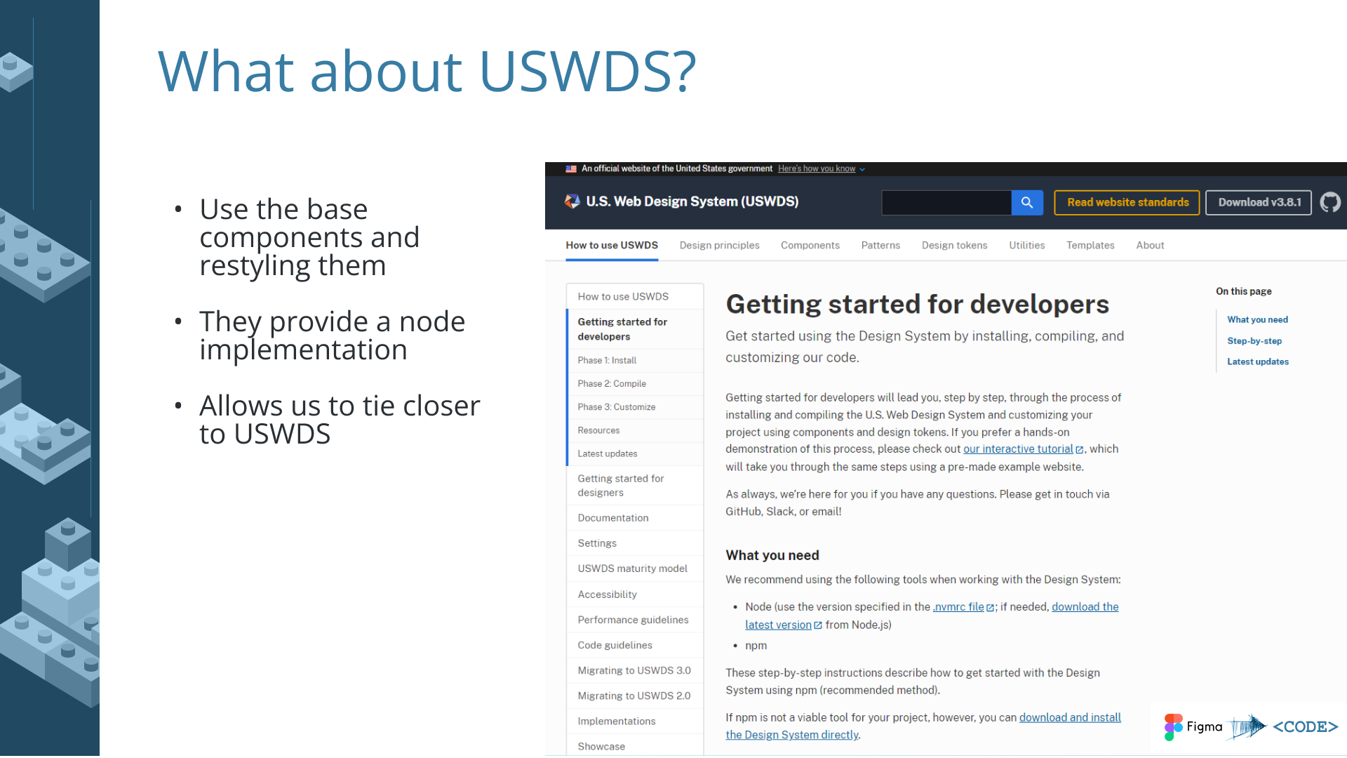
I led a design system project grounded in the U.S. Web Design System (USWDS) – an open-source design system created and maintained by the General Services Administration’s Technology Transformation Services. USWDS provides accessible, mobile-friendly UI components, design tokens, and UX guidance specifically built for federal government digital services. It includes built-in compliance tooling for Section 508 accessibility requirements and the 21st Century Integrated Digital Experience Act (IDEA).
What I Delivered
- WCAG AA color compliance – audited and updated the color palette to meet AA contrast ratios across both brands
- Scalable, maintainable components – built on USWDS foundations with customizations for FedPoint’s specific product needs
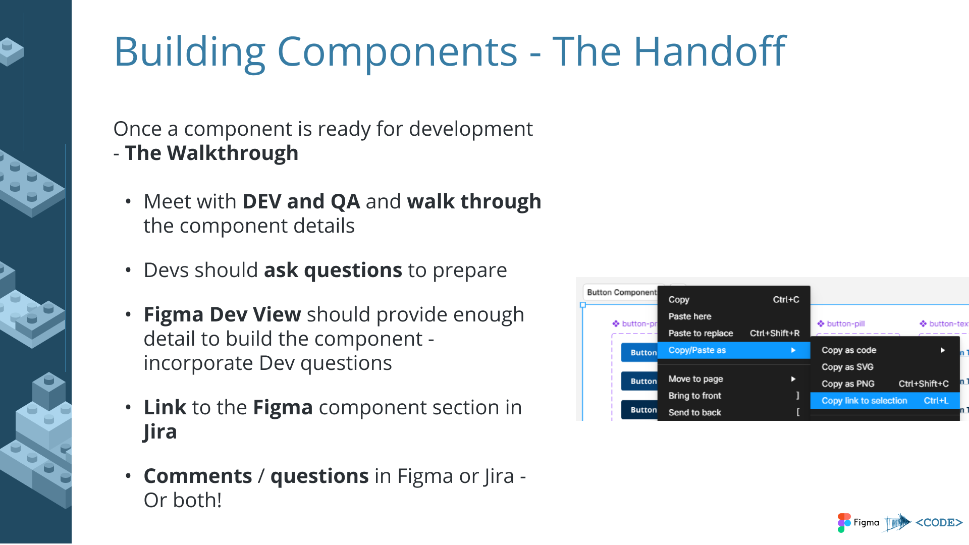
- Developer handoff documentation – recommendations and code examples so engineering teams could implement components without ambiguity
- Dual-brand architecture – components designed to work across two differently branded systems from a shared base, using design tokens for brand differentiation
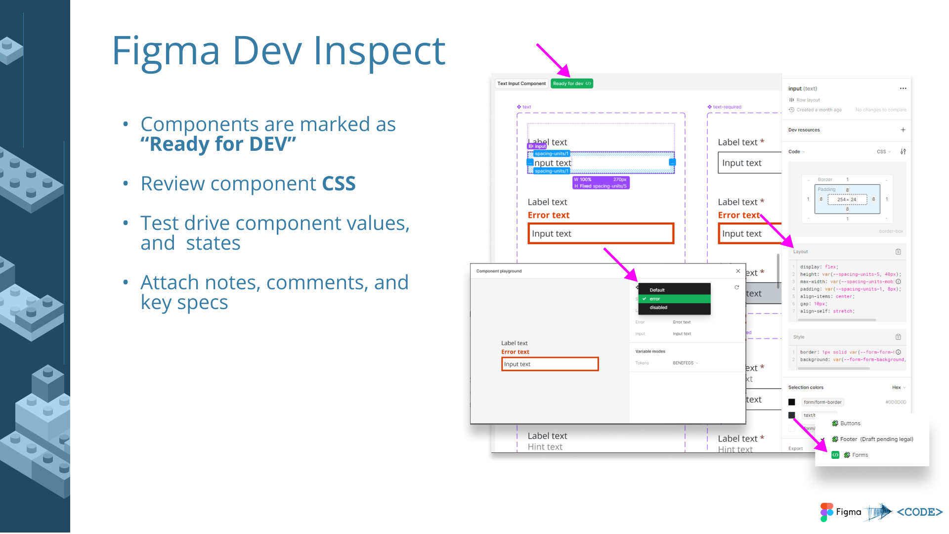
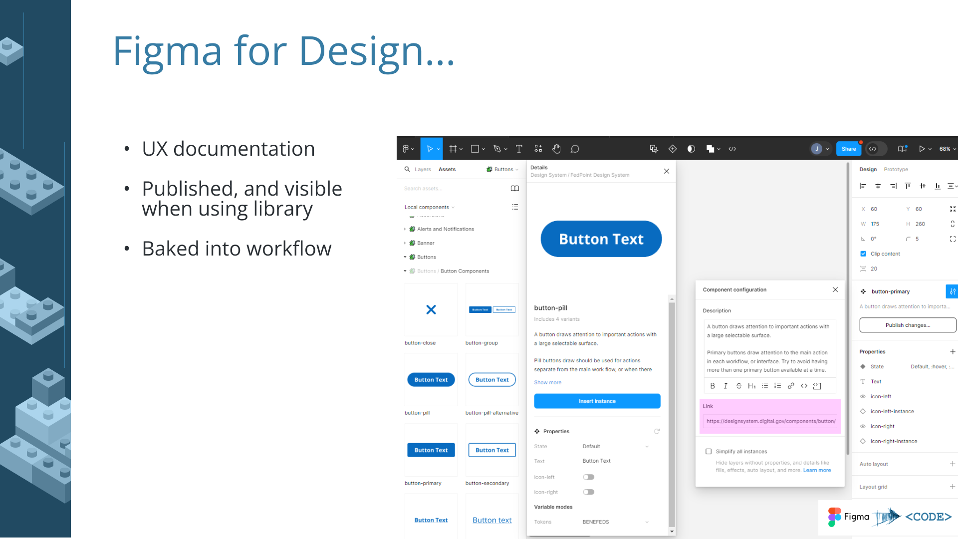
- Figma best practices – component library built following Figma’s recommended patterns for maintainability and team collaboration
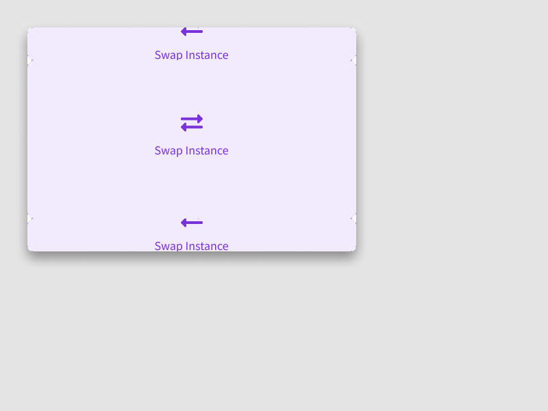
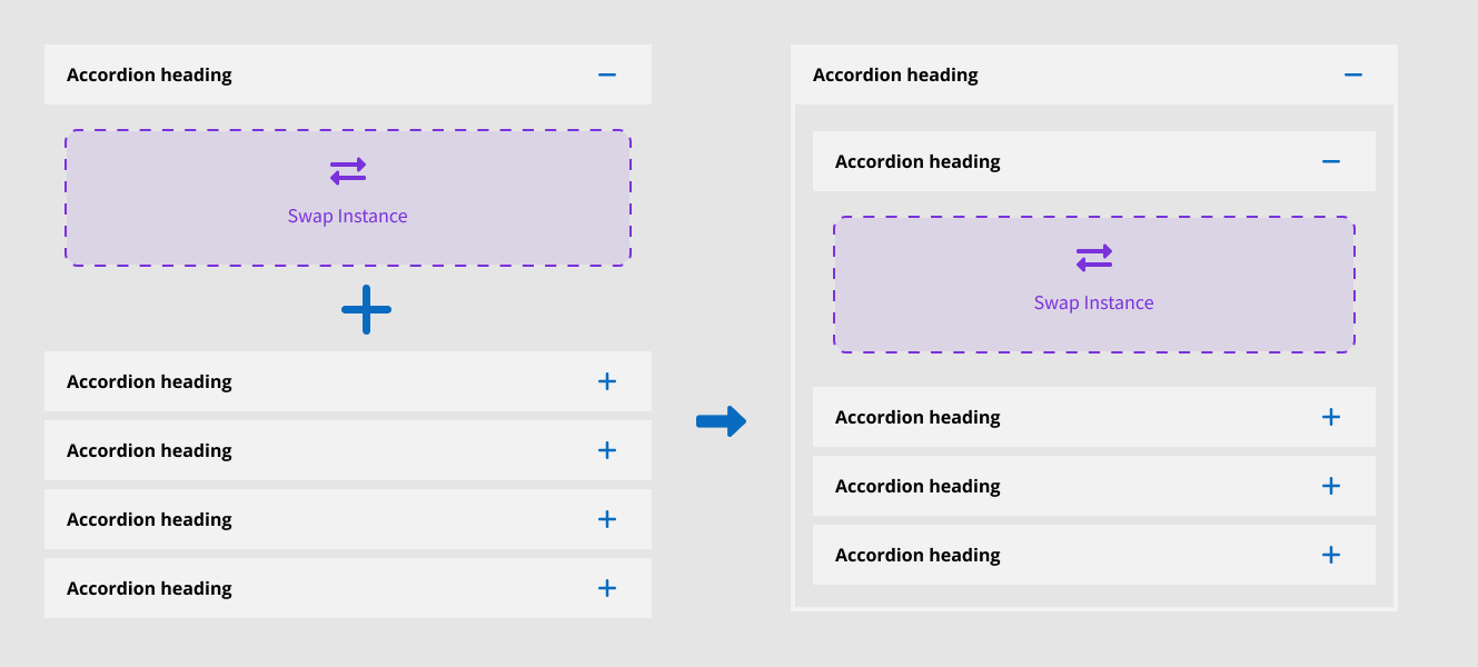
Slot Components
I built several components using a “slot” architecture – a pattern where a placeholder container inside a parent component accepts swappable content. This allowed base components to be highly customizable without generating infinite variants. A card component, for example, could accept different content configurations in its slot without needing a separate variant for every combination. This kept the component library lean while giving designers the flexibility they needed.


Implementation Roadmap
I also delivered a proposal presentation outlining the next steps for design system adoption, governance, and scaling across FedPoint’s product portfolio.
Key Principles
What Makes Design Systems Work
Documentation
Clear specs that engineers actually use, not just designer references. If the documentation doesn’t answer a developer’s question in under a minute, it’s not good enough.
Governance
A defined process for additions, modifications, and deprecation. Without governance, a design system becomes a component graveyard – things get added but never maintained or retired.
Pragmatism
Built for adoption, not theoretical perfection. A system that ships with 80% coverage and gets used beats a comprehensive system that teams resist implementing.
Evolution
Systems that grow with products, not against them. The best design systems have clear extension points and contribution models so they absorb new patterns rather than blocking them.
Impact
| Engagement | Metric | Result |
|---|---|---|
| PowerSchool (Migration) | Pages Migrated | 6,000+ pages converted from legacy markup to standards-based HTML via automated tooling |
| PowerSchool (Components) | Ecosystem Adoption | Component library used by internal teams and an external customizer ecosystem across thousands of districts |
| PowerSchool (Design System Bridge) | Handoff Efficiency | 40% reduction in design-to-development handoff time through shared visual patterns |
| PowerSchool (Design System Bridge) | Consistency | Visual parity with Angular-based design system without codebase rewrite |
| SNHU (Confetti) | Cross-Team Consistency | Shared component specs adopted across multiple application teams in the ecosystem |
| FedPoint (USWDS) | Accessibility | Full WCAG AA compliance across dual-brand component library |
Reflection
I’ve been doing design systems work since before the industry had a vocabulary for it. The 2010 component library at PowerSchool wasn’t called a design system – it was just the obvious solution to the problem of maintaining consistency across 6,000 pages and an ecosystem of third-party customizers. But it had all the hallmarks: reusable components, standardized markup patterns, self-documenting code, and a theming architecture that propagated changes automatically.
What I’ve learned across these engagements is that design systems are as much about governance and adoption as they are about components. The most elegant system fails if teams don’t use it. My approach prioritizes pragmatic solutions that engineers want to implement over theoretical perfection – because a design system that ships and gets adopted is infinitely more valuable than one that exists only in a Figma file.
The pattern has been consistent across my career: understand the constraints (legacy code, multiple brands, non-technical users), design for the actual adoption context (not the ideal one), document relentlessly, and build systems that evolve with their products rather than against them.