The GO Outdoors project was a design exercise aimed at creating a conceptual GPS app for backpackers and hikers. The focus was on developing an intuitive and modern interface that simplifies the process of finding and creating routes for outdoor adventures. During this exercise, the team explored user needs, sketched wireframes, and designed a user-friendly flow. The project served as a valuable exploration of design principles, user experience, and competitive analysis, offering a comprehensive look at how a potential product could be developed to meet the demands of outdoor enthusiasts. While not a finished, shipping product, the exercise provided key insights and experience in the app design process.
Go Outdoors Mobile App
Project Description
Introducing GO Outdoors—your essential GPS app for backpackers and hikers. With a sleek and intuitive design, GO Outdoors streamlines the process of discovering and planning your trips. Whether you’re exploring well-known trails or venturing off the beaten path, this app makes route finding and creation simple and enjoyable. Effortlessly locate popular routes, customize your own, and monitor your progress in real-time. GO Outdoors is designed to enhance your outdoor experiences, allowing you to focus on the journey while the app takes care of the navigation. Start your adventure with confidence and explore new horizons with GO Outdoors!

Competitive Analysis

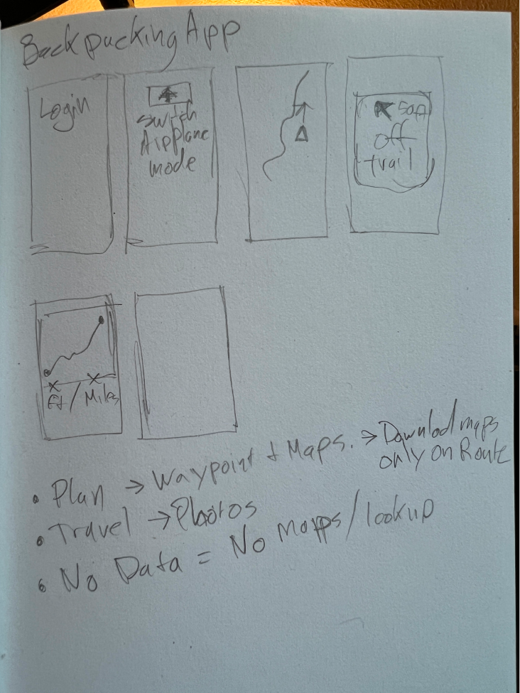
Sketching
I start with rough sketches on paper or a whiteboard to visualize the basic layout and structure of the app’s screens. I focused on key screens such as the home screen, map view, and route planner.

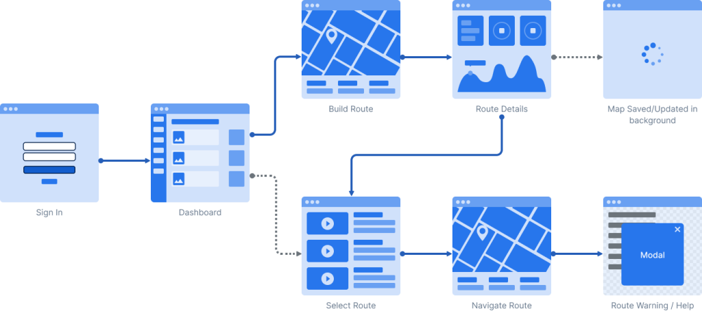
User Flow Diagrams
I create flowcharts to outline how users will navigate through the app, from opening the app to completing key tasks like finding a route or tracking their hike.

Wireframes
I developed more detailed wireframes that define the placement of elements like buttons, menus, and maps. These wireframes should be simple, emphasizing functionality and layout rather than aesthetics.
Visual Style Considerations
Begin thinking about the visual style, including color schemes, typography, and iconography, while keeping the app’s branding and user preferences in mind. While usability is key to an application’s success, branding can affect the perception of quality to the end user.
Prototype
As the design becomes more concrete, move towards high-fidelity mockups that showcase the final look and feel of the app, incorporating visual design elements. I created clickable high-fidelity prototype to simulate the user experience and further refine the flow and interactions.


